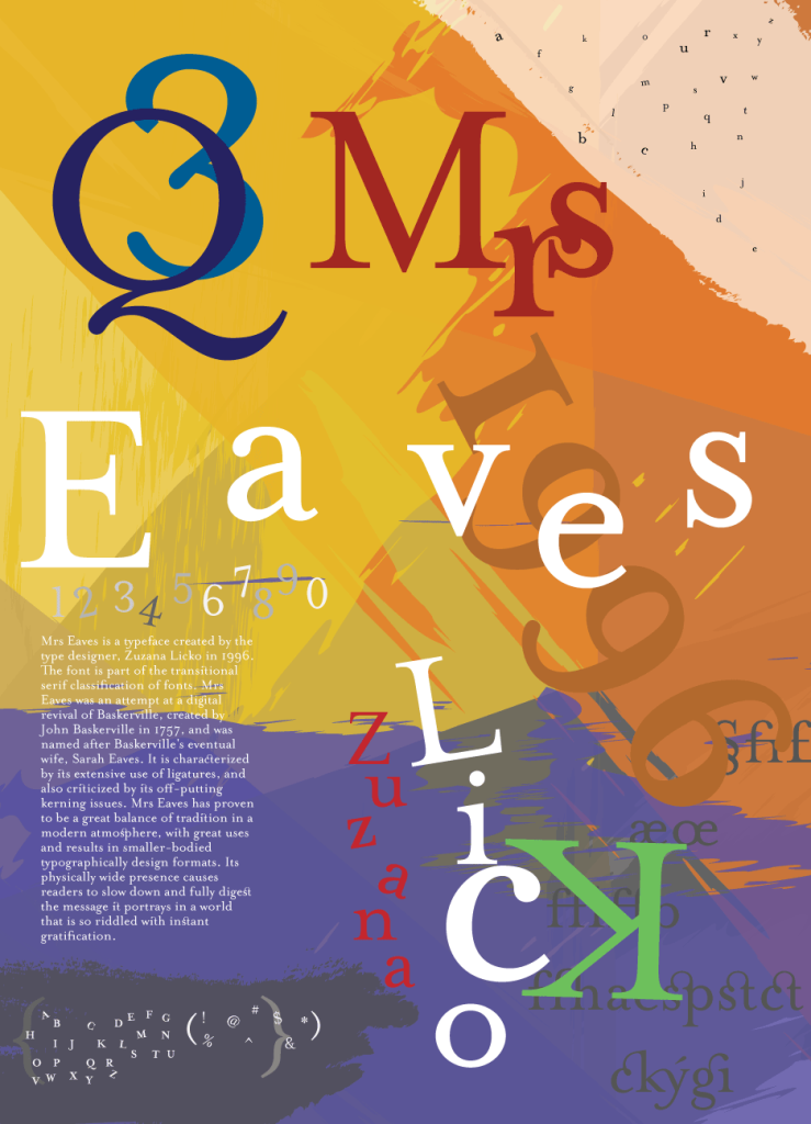
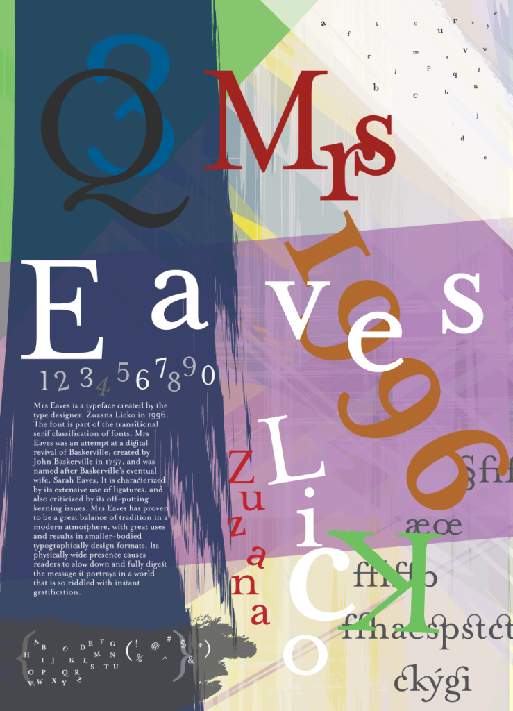
A digital mockup of a type-specimen poster for the typeface – “Mrs Eaves”.
The Problem
I was assigned to create a type specimen poster for Zuzanna Licko’s ‘Mrs Eaves’ typeface. It was to be designed in the style of the time it was created, in this case 1996.
The Solution
I created a couple mockups that were conservative at first, pulling inspiration from magazine ads and movie posters. I stepped back and tried to get a perspective of what Mrs Eaves was really about – Baskerville – and then the real sense of style that Licko and Emigre had. This was triggered with I was watching “Helvetica” and David Carson’s features appeared and something in me clicked. Then I arrived with these two designs. I picked the latter for my final composition.


